Quick Tips for Successful High-End Printing
Article by Scott Fresener
Printing Simulated Process Color, CMYK and Index Color on light and dark shirts can be very rewarding and also very frustrating. If you have never done this type of printing you might be shocked at the high mesh counts and type of ink used. If you normally print spot color and heavy athletic printing this will be MUCH DIFFERENT. In order to have great results with T-Seps/FastFilms or color separations provided by us you may need to change your thinking on how you print and make screens. It is important to try to follow these guidelines.
The first reaction screen makers and printers have when presented with their first high-end job is “we can’t do this.” The truth is if you go to www.T-Seps.com and look at the handful of sample images, they are ALL done using the following techniques. Hundreds of thousands of shirt jobs have been printed using these methods. This is NOT the same as general logo/spot color printing and it requires an open mind. The truth is that printers and screen makers just need to buy into how the world of high-end printing is done and be open to new ideas that on the surface appear impossible.
Color Separations
You can pay to have an experience color separator do the seps or you can use a program like T-Seps or FastFilms. These programs have been used for over 10 years by most of the world’s largest printers. The following directions are the same exact specifications found in the Manual for those programs.
If you own T-Seps or FastFilms why would you need to use an experience separator? The truth is I do separations all day long for large and small companies. Large companies doing work for NASCAR, Disney, Harley and others often have a season rush and get behind. I do their overflow. Most printers who do this type of work use FastFilms or T-Seps. Smaller printers with these programs often get complex jobs where they want to really shine. And, some printers don’t do enough high-end work so they are not always as familiar with the tweaks needs for critical jobs. For a flat fee of $75 it is sometimes easier to have the seps done outside to save the hassle.
Film Output
When trying to expose very fine halftone dots you must have a film positive that is dense black in the image areas. That means vellum many not be the best choice for critical work. Many printers still use a laser printer with vellum and if that is all you have then you will just have to work hard to hold the small halftone dots.
You can get excellent and dense black film output from imagesetters or from inexpensive inkjet printers using a software RIP like T-RIP (raster image processor) that tells the inkjet printer to lay down more ink.
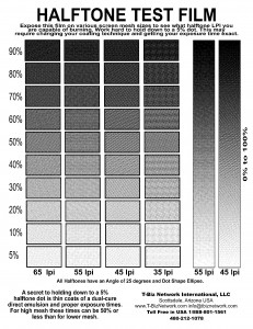
 Download our new TEST FILE HERE. Print this on film and expose various mesh count screens or if you have Direct-to-Screen – print this to your emulsion. The goal is to see what halftone dots you can hold. You need to get your exposure times low enough that you can hold down to a 5% dot! Do NOT change the size or resolution of this file. It is pre-set with various halftone dot sizes and changing the size will alter these. This file is 1440dpi in order to keep the halftones very clean. It is 26mb and is a ZIP file that needs to be unarchived before you can use it. Save it to your computer first and don't try to "run" it or "unarchive" it during the download process.
One of the secrets to printing photorealistic images is HOLD THE DOTS on the film and on the screen. If you lose halftone dots then the image on the shirt will not look like the image on the computer. Halftone dots on vellum or laser acetate are not very dense and the exposure light burns through the fine dots.
The proper halftone screen angle is also important and may seem unorthodox to the untrained printer. For Simulated Process Color (not CMYK), use 25 degrees, elliptical dots for ALL COLORS. Trust me.
For real CMYK prints use the angles of C 15, M 45, Y and K 75 if you insist on having a "rosette" pattern but better yet use the angle of 25 degrees for ALL colors. Again, trust me.
For most general high-end jobs use a line count/frequency of 55lpi. If you run automatic presses and have critical jobs you can go to 65lpi and even 75 lpi. If you are using vellum or laser acetate then drop down to 45lpi.
If the job is Index Color (no halftone) the art department MUST have the job at the final print size and around 200dpi resolution before they separate it. The resolution will be the size of the small square pixels/dots and these will be VERY SMALL on the films and a typical screen maker comment is “we can’t burn that.” Read the following….
Screen Making
All screens should be properly tensioned. At best, use retensionable or rigid aluminum screens that have a tension of 25 – 30 Newtons. If you have wood frames, use the tightest ones you have. Yes, these images will work with wood, but you will lose some detail and may not have as good an Underbase. Don’t let your lack of the best frames stop you. Just work to use tight screens that are on stable frames.
The proper mesh count is critical. For most photorealistic jobs use a 230 mesh (90cm) for the underbase (go lower if the design has a lot of solid bright colors), and a 305 mesh (120cm) for the top colors. The first reaction is “I can’t get my white ink through a 230 mesh.” Not true. If you use a small amount of curable reducer and reduce the viscosity of the white so it is creamy it will work. You are NOT trying to lay down a rock solid white layer of thick plastisol for an underbase. The highlight white (last color down) will make the white pop where you need the pop.
When ordering screens try to get the 230 mesh screen for white ink with a thicker thread diameter. This will help make the stencil thicker and give you a better deposit of white.
Proper stencil preparation is critical and goes along with HOLD THOSE DOTS.
If you have never exposed high mesh screens you need to forget what you know about exposure. Your exposure times for 305 mesh will be 20% of that for your 156 mesh. You MUST use direct emulsion. You must use thin coats of emulsion (1 coat on outside/bottom, 1 coat on inside). If necessary come back after you dry the screen and give it another coat on the outside. And, use the sharp edge of the scoop coater.
The best emulsion to use is a dual-cure (two part) emulsion. It has more latitude and is more forgiving that one part photopolymer emulsions which have a very fast exposure time.
The way to tell if you can hold the small 5% dots is to do test screens. Have the art department create a test film with squares filled with 2%, 5%, 10%, 20%, etc., halftone dots. That way you are not guessing at what size a dot is. Coat and expose the screen. Work hard to expose the 5% dot. Yes, it can be done. You will probably not be able to hold the 2% dot. That means if there are very subtle design changes these might be in the 2% to 5% area. Great screen makers do it all the time. The secret is keep reducing your exposure times. If you are using a pure photopolymer emulsion (one part), you might find times as low as 10 seconds!
For most non-critical cartoon or freeform graphic images it may not really matter if you don’t hold anything below a 10% dot.
If the job is Index Color then all the dots on the films are the same size. If you can burn one of them you can burn them all.
Inks
Simulated Process jobs are normally printed with a good high-opacity white for the underbase and highlight whte, and standard off-the-shelf plastisols for the top colors. Most colors are fairly creamy in the container but the white can often be very stiff. To get the white to print better simply add a small amount of curable reducer to the ink. Many brands recommend “soft hand” and this can work but a liquid reducer is better. It may seem counter intuitive to reduce white ink to get better opacity but the truth is when it is very thick it requires much more pressure on the squeegee which drives the ink into the shirt. By reducing the ink it clears out of the screen easier and lays ontop of the shirt.
If the job is Process Color CMYK, you must use special inks. You need the colors of Cyan, Magenta, Yellow and Black. These inks are very thin and transparent. They work well on light shirts but tend to mute down if printed on a base of white. That is why they are rarely used on black shirts. Some companies offer “triple strength” process plastisol with a heavier pigment load. If you must print CMYK on an underbase on dark shirts, consider using triple strength.
Printing Technique
Use medium-hard squeegees that are sharp. Triple durometers are better (70/90/70).
For the underbase try to do one good stroke. If necessary a second stroke may help coverage. You may need to slow down the stroke to get the ink to clear. Try to hold the fine detail in the image. You ARE NOT really looking for the white to jump off the shirt. This is the job of the Highlight white! Flash cure after the Underbase. This is the most critical print. If the underbase looks good as a black and white image then everything else should look good.
If the job has a lot of solid spot colors you may have to print the underbase through a lower mesh count and in some extreme cases print the base, flash cure, print the base again, flash and then print the colors. This more important when doing athletic type photorealistic images where the final feel/hand of the print is not important.
Since the underbase is through a high mesh, it will flash cure very quickly. You can place the flash cure unit 1 to 2 inches above the print and often get a skin cure in five to ten seconds.
The colors are printed wet-on-wet ontop of the underbase white. If they are smooth and creamy on a high mesh you should be able to do one clean stroke. Some jobs with a lot of colors may need an additional flash part way through the print order.
DO NOT PANIC until the last color is printed. Often, it is the Highlight that brings it all together. It brightens areas and lightens other colors. If printing a second white last in the sequence seems totally wrong, just give it a chance. This is often the magic that makes the print pop off the shirt.
For CMYK Process jobs, you must use a very consistent squeegee stroke. If you do too many strokes or “mash” the ink through the mesh, your dots will gain too much and the print will be muddy.
General Suggestions
If a design does not look like the original art, modify an ink color and try different color sequences. This is normal when printing on dark shirts. It generally takes more than one shirt for an image to settle in and print correctly. There are many variables that affect the final print, from screen tension to quality of the printing press, and technique of the printer or machine. Adjustments at the screen press are commonly performed by high-end printers.
Print on a good shirt. DO NOT use a test square – other than for lining up the screens. The print needs to have the absorbency of the shirt AND the tighter the knit the better. 100% cotton is obviously better than a 50/50 Cotton/Polyester blend because of the dye migration from the shirt.
If you are printing on fleece or a polo shirt with a rough texture you will need to lower your line count and accept the fact that the print will not be as clean as on a T-Shirt.
Be Positive
Having done thousands of separations, I know that some customers will simply not agree with the proper techniques and will use low mesh counts (110 is all we had), poor film output, and bad printing technique (this is not athletic printing). At the end of the day, the bad print quality is blamed on bad separations. Once you have had success with these techniques you will go out of your way to tell customers to “bring it on.” You won’t turn down any jobs or be afraid of photo realistic images.


